Our library uses Twitter (@kbcclibrary) to communicate with our students and faculty. Along with our tweeting, we rely on metrics to keep tabs on our Twitter presence. We get these metrics exclusively from free tools: the native Twitter Analytics page, but also third party analytics sites like Tweetstats and the free version of (the unfortunately named) SocialBro.
I like Tweetstats, because it is clearly a passion-project of one developer. For some time, I regularly used Tweetstats’ “tweets by month” chart to make sure we were on track to meet self-imposed targets of tweets for the month.
But problems came up in December and January when Tweetstats stopped working reliably. It became so inconsistent that it was unusable. When I learned that the Tweetstats creator was trying to sell the site, I basically gave up on the service. I reluctantly looked at other free tools that might offer a similar display of tweets per month, and was quickly reminded that the world of third party Twitter analytics sites is pretty unappealing.
An obviously better solution is to build the functionality I needed for myself. It would be a good programming challenge, and we’d end up with a home-grown analytics tool. Our library has built tools on the Twitter API previously, so I didn’t need to start from scratch.
Creating a list of tweet dates from the API was not too difficult; what proved more challenging was producing a visual representation of this data. I imported pandas, numpy and matplotlib, all of which were unfamiliar to me. I spent a lot of time messing with pandas dataframes. In the end, the result was a visualization that looks like this:
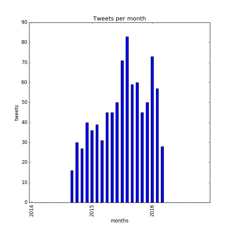
It’s not pretty, but it is exactly what I needed.