Using Twarc-Report, a tool made by Peter Binkley at the University of Alberta Libraries, I made some visualizations of our library’s archive of twitter data. Here’s one of them:
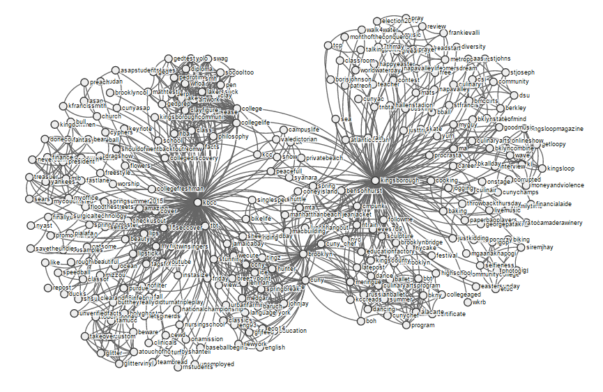
This shows how the hashtags in various tweets about Kingsborough are related. You can see the full interactive version of that visualization here.
Neat, right? Twarc-Report builds visualizations based on data captured by Twarc. It uses d3.js, a javascript library that provides tools for data-based manipulations of the DOM. Twarc-Report does this nicely, and it prompted me to try something similar with some other library data.
The APIs for Primo, CUNY’s discovery layer, provide interesting data and metadata about searches. Using d3.js and Flask, a Python framework, I made a web tool to visualize some of this information. This tool takes the user’s search terms and parameters, makes an API call to Primo, and passes the resulting data to a d3.js script (adapted from here) to make the visualization. The whole thing produces something that looks like this:
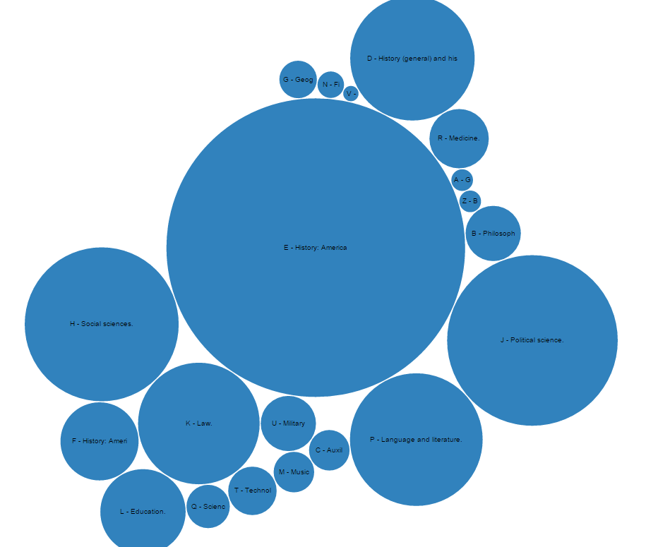
This is a visual rendering of where Kingsborough books with the keyword “president” appear in the Library of Congress classification. You can try the tool yourself here; the code is also on GitHub.