For almost five years now, our library has been archiving tweets about our college. I’ve posted about that here and here. Until recently, I didn’t really have an agenda for this data, other than preserving it. Last week that changed. At our college’s Data Faculty Interest Group, I mentioned the tweet archive as a potentially useful data set. Dorina Tila, the chair of the FIG, had a great suggestion: why not use the data for some sentiment analysis?
I immediately got to work coding up a prototype. I used some Python libraries to chart sentiment about Kingsborough over time: Textblob to score the tweets based on sentiment; pandas to wrangle the data; and matplotlib to produce a nice chart:
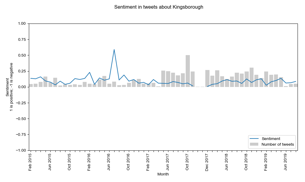
While this chart is interesting, it’s not ready yet. Specifically, the archive has a lot of false positives: Tweets that mention the words Kingsborough or KBCC, yet have nothing to do with our college. These need to be removed from the dataset before the data can produce a meaningful chart. Just by eyeballing the data, my estimate is that 30-50% of the 14,210 tweets will need to be removed. However, sorting through that many tweets is a really big job. I’m not sure how to tackle this yet, but I hope to get it figured out soon. At that point we can produce a meaningful sentiment chart.